Over 1 billion websites are active on the internet today, and it takes a user only 50 milliseconds to evaluate the appearance of each site.
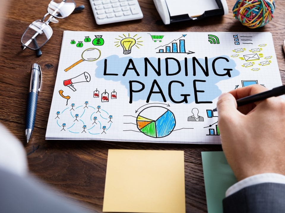
With overwhelming consumer choice, it’s challenging to get high conversion rates for your website. How can you differentiate yourself from the sea of landing pages?
By following these 5 principles of high converting Boise web design, you can boost your website’s success.
5 Principles of High Converting Boise Web Design
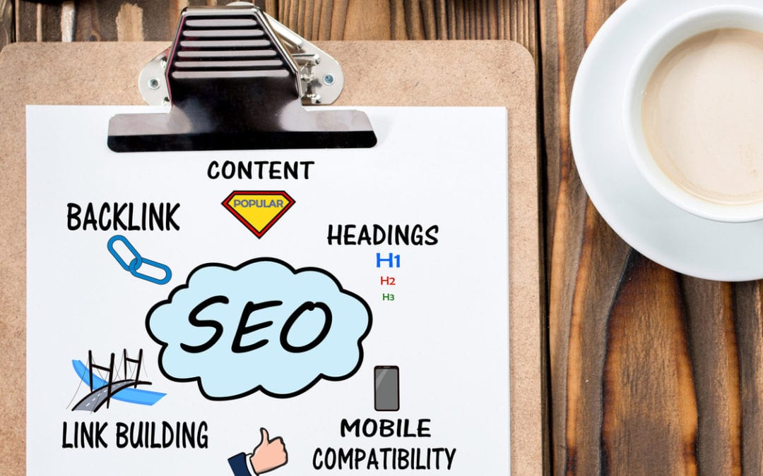
You should keep in mind that, if users can’t find you, your conversion rates are already nonexistent. By utilizing search engine optimization techniques, you can push your website to the top of search results.
Once you’ve honed your website’s SEO strategy, the following principles of high converting Boise web design will lead to fruitful conversions.
1. Highlight Your Call to Action
Your call to action is the number one element in creating website conversions, so it needs to stand out. Make sure the call to action is obvious to the user without scrolling around the page.
To make it more noticeable, consider adding a border or a pop of color to draw your reader’s eyes.
2. Readability & Flow
Once your call to action is front and center, the page organization should have an explicit hierarchy. For example, readers infer type in larger fonts is more important than other information.
Additionally, studies show page visitors only read around 20% of the content, meaning you can use fonts and headers to get your message across quickly, while still pushing your reader to act.
3. Simplicity
Keeping your website simple is a great way to compliment readability. Adding excess content can overwhelm visitors and compete with your call to action.
In fact, for every element you add to your site, you’re distracting the user’s attention from your main call to action by about 50%!
4. Whitespace
In keeping with a simple design theme, you can utilize whitespace to your advantage. By removing competing imagery and text, your central call to action becomes much easier to find.
Think about Google’s home page. Because of the whitespace surrounding the search field, your eyes are immediately drawn to the site’s main call to action.
However, be careful in using too much whitespace. After a certain point, readers feel the site lacks design altogether or is untrustworthy.
5. Visual Cues & Images
In contrast to whitespace, a healthy dose of imagery and visual cues help guide your reader to your call to action. For example, use a colorful arrow to direct the eye to your subscription button.
Large landing page images are also known to improve conversion rates. Draw your visitor in with a high-resolution image that speaks to the goal of your site. The best images will evoke emotion from the reader, inspiring them to act.
Online competition for user attention is only going to increase. Utilizing these 5 principles is a great start towards optimizing your website’s conversion power.
Also, don’t be afraid to recruit help from a reputable Boise SEO company that can assist in both web design and SEO services to maximize your website traffic and conversion rates.
Have other tips that have increased your conversion? Leave a comment below and let’s talk about it!


