6 Ways to Build a Strong Internet Presence That Attracts Customers
March 29, 2019
Is Google Adwords Worth It? 5 Reasons Small Business Definitely Benefit from It
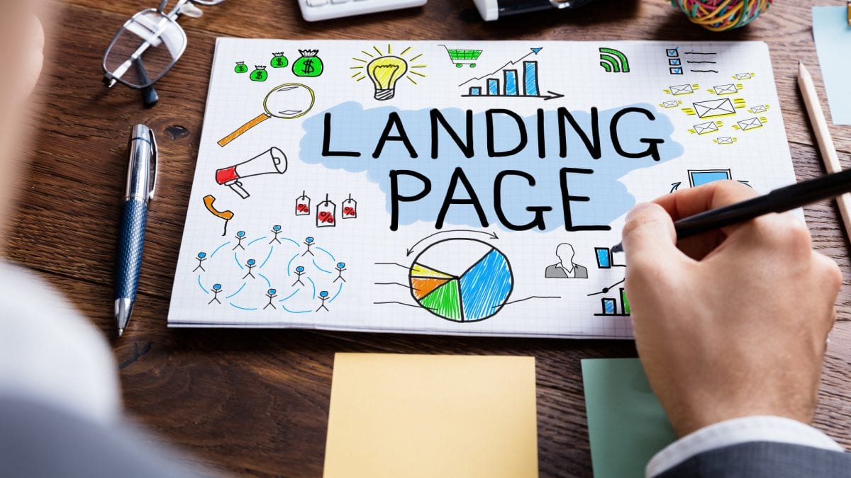
May 7, 2019Not using a landing page design is likely why your site sales are lackluster.
Here’s the scenario:
A person discovers your site through Google. They click your link and get bombarded with information when the page loads. Their eyes scan the page but don’t make an immediate connection… and so they bounce.
The lack of focus and intent was the barrier. A landing page removes them.
Keep reading to learn how you can add landing pages to your efforts. Plus, helpful tips and strategies to refine the experience and increase conversion rates. You’ll also get a valuable resource at its end — so stick around.
Why You Need to Build Landing Pages
Landing pages meet a few marketing needs:
- Pitches an offer without distraction
- Funnels visitors to the desired action
- Collects and provides valuable feedback
The landing page is one of several tools for conversion rate optimization.
A well-crafted page has the sole intent of getting a user to take action. This is very different from your website where you’d want them exploring. The experience and message get refined so it satisfies the user’s intent.
Typical landing page use includes:
- Ads
- Outreach
- List building
- Sales letters
- Events
The simplicity of the page is all you need to know. It’s about stripping away distractions that would drive people away from the message. You use these in campaigns where you desire sales, sign-ups, and engagement.
The point: Use landing pages if you want to increase conversion rates.
Our Top Landing Page Design Tips
We want to take a second to note that you should have a goal when designing your landing page. Your options usually include either A) signups, or B) sales.
There is a difference in how you apply the following tips to your page based on the goals. Yes, there is some overlap, too, but keep goals in mind either way.
Craft Strong Headlines
The headline is what visitors see first when visiting the landing page. You have seconds to capture attention and interest.
You could use a formula like:
- The Secret of [XYZ]
- How to Solve [XYZ] Problem
- What You Should Know about [XYZ]
Or, lead with a strong hook or benefit.
Test headlines using what you found effective in prior marketing and ad campaigns. Look at what competitor’s use and remix their efforts. Or, poll and test headlines with followers, nailing what draws the highest attention.
Tell a Story
Storytelling is effective because it will:
- Connect with the audience
- Subtly pitch the offer
- Tout benefits over features
Stories can involve your personal journey into the product or service. Or, told through the voice of a customer persona. This includes using terms, tone, and values your visitors hold — as if you’re talking to them directly.
Refine your target audience:
- Use analytics to find who usually buys from you
- Check who’s most active on your social feeds
Talk to that person versus attempting to reach everyone. This increases engagement and helps craft the storytelling.
Use our guide to crafting compelling copy. The skills are as applicable to ads as they are to your landing page storytelling.
Show. Don’t (Always) Tell
Older landing page best practices would have you crafting 10+ page epics. Today, attention spans are short and we’re mostly visiting sites using phones. We’ve shifted from text-based content to images and videos.
Use:
- Stark, impactful hero images
- Real photos of the offer and it in-use
- Client testimonials and experiences
Let the media speak for your product or service. Use media to hook them into the story, having them imagine what it’s like having what you’re offering.
Ultra-Fast Load Times
Your visitors judge your site/brand before they see the headline. A slow page will have users bouncing. Your landing pages efforts are moot if they don’t stick around.
Remedy it:
- Get faster, reliable hosting
- Remove unneeded scripts
- Trim bloated sections
Run the landing page through a site speed test. Aim for a load time under 1-2 seconds. Optimizing it shouldn’t pose a problem since the intent is simplicity.
Detail It
This is a delicate balance:
- You want to keep the page simple
- You want to give all the info visitors want/need
Details include product features, sizing, price points, and the like. This again is where media plays a role. And, interactive features.
- Convey features through images/videos
- Use hover-overs to expand item specifics
- Let reviews talk about the finer details
Poll customers seeing what features and benefits mattered most. Strip superfluous information from the listing. Then, highlight the main points while leaving extras discoverable through interactive features.
Be Succinct in Your Message
Create parallels and continuity with:
- Branding
- Message
- Tone
Avoid jumping between content styles, formatting, and ideas. Likewise, include branding elements to remove doubts they’re on the wrong page. Finally, set the tone and a sense of urgency to nudge visitors toward the desired action.
These can help in the design:
- Read and re-read the entire page
- Note what is and isn’t working
- Remove fluff, reinforce the good stuff
Let others work through the page before launch, too. Get their feedback and use it to refine the direction and focus of the page.
Add Trust Factors and Incentives
Why should someone buy the product? What makes your business trustworthy? You can convey benefits and features all you want but the resistance remains.
Remedy it:
- Use testimonials and reviews
- Use endorsements from industry pros
- Use logos to associate with authority
These trust signals help visitors overcome their hesitations.
Likewise:
- Offer discounts and promos
- Use freebies and sign-up incentives
People love receiving free stuff when signing up. They love discounts when buying products. Go ahead and use these two to increase conversion rates.
Test It, Constantly
Never settle for the one-and-done design. Run A/B tests and optimize it whenever you can. Even small changes improve ROI.
Test:
- Headlines
- Images
- Call-to-actions
- Media
- Price points
- Structure
Choose one item to change at a time, creating a page variant. Divide traffic between the two pages. Then, use the higher performing one as the new standard.
Let Us Build Your Landing Pages
We’d love to show you what happens when you have a great landing page design. We’re confident your inclusion of them will improve engagement and sales. We’d love to talk and discuss what’s possible.
Get started by getting in touch for a free site analysis.
We’ll then reach out with a 30-minute talk explaining how we can add value to your online presence. Don’t wait, let’s get this project started!


